Spotify
Spotify
Spotify
Role
UX/UI DESIGner
Service
Feature Addition, Product Design, UX Researcher
Tools
figma, FigJam, Zoom, g-suite
Year
2023

Background
Spotify is a digital music, podcast, and video service that gives you access to millions of songs and other content from creators worldwide. Primarily, users subscribe to Spotify to stream music and podcasts across their devices, from mobile phones to televisions to desktop computers. Spotify allows users to pick up where they left off with a song or podcast on any of their devices at any time. Their mission statement leads their intentions with “Spotify’s mission is to unlock the potential of human creativity by allowing a million creative artists to live off their art and billions of fans the opportunity to enjoy and be inspired by it.” but, from the user’s perspective, Spotify is not a tool to unlock potential - it is a way to listen to an all-encompassing library of audio on any device, at any time for a low monthly subscription fee.
Challenge
Designing a new feature that helps users feel more connected to their community and that integrates seamlessly into Spotify’s existing design system.
Problem
Spotify has excelled at providing a seamless listening experience for its users and continues to offer intuitive features that help them discover or rediscover the audio they would like to listen to. Despite these improvements, Spotify could benefit from an added activity feed for users to view what the people they follow are currently listening to. I would like to add an activity feed feature because “unlocking the potential of human creativity” can genuinely be fostered when we connect, curate, and criticize content produced by real people listening to audio in real-time. Also, the desktop application currently has an activity feed that would suit the mobile build well. I would like to expand upon this idea and develop it for mobile users.
Solution
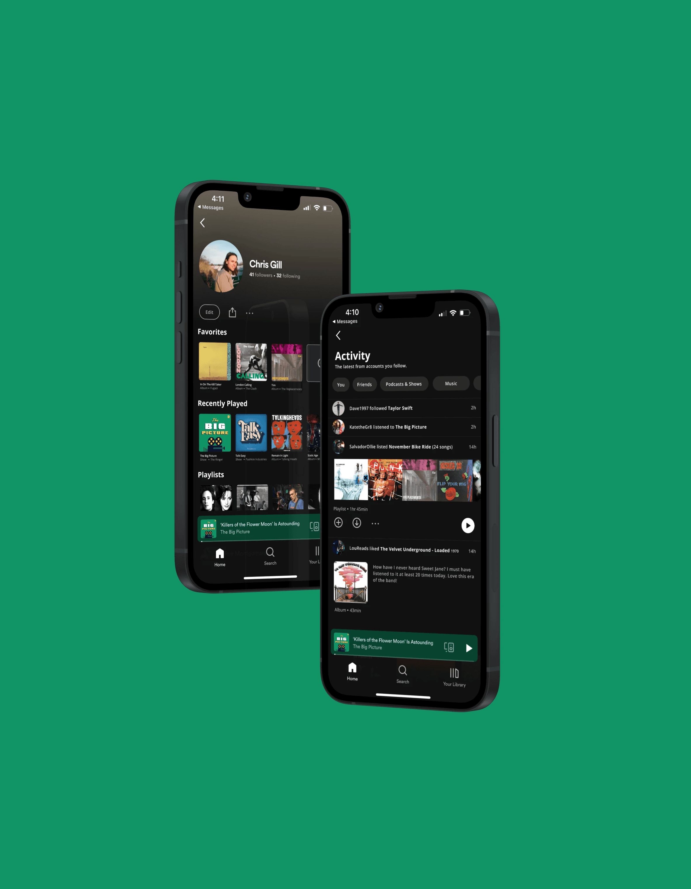
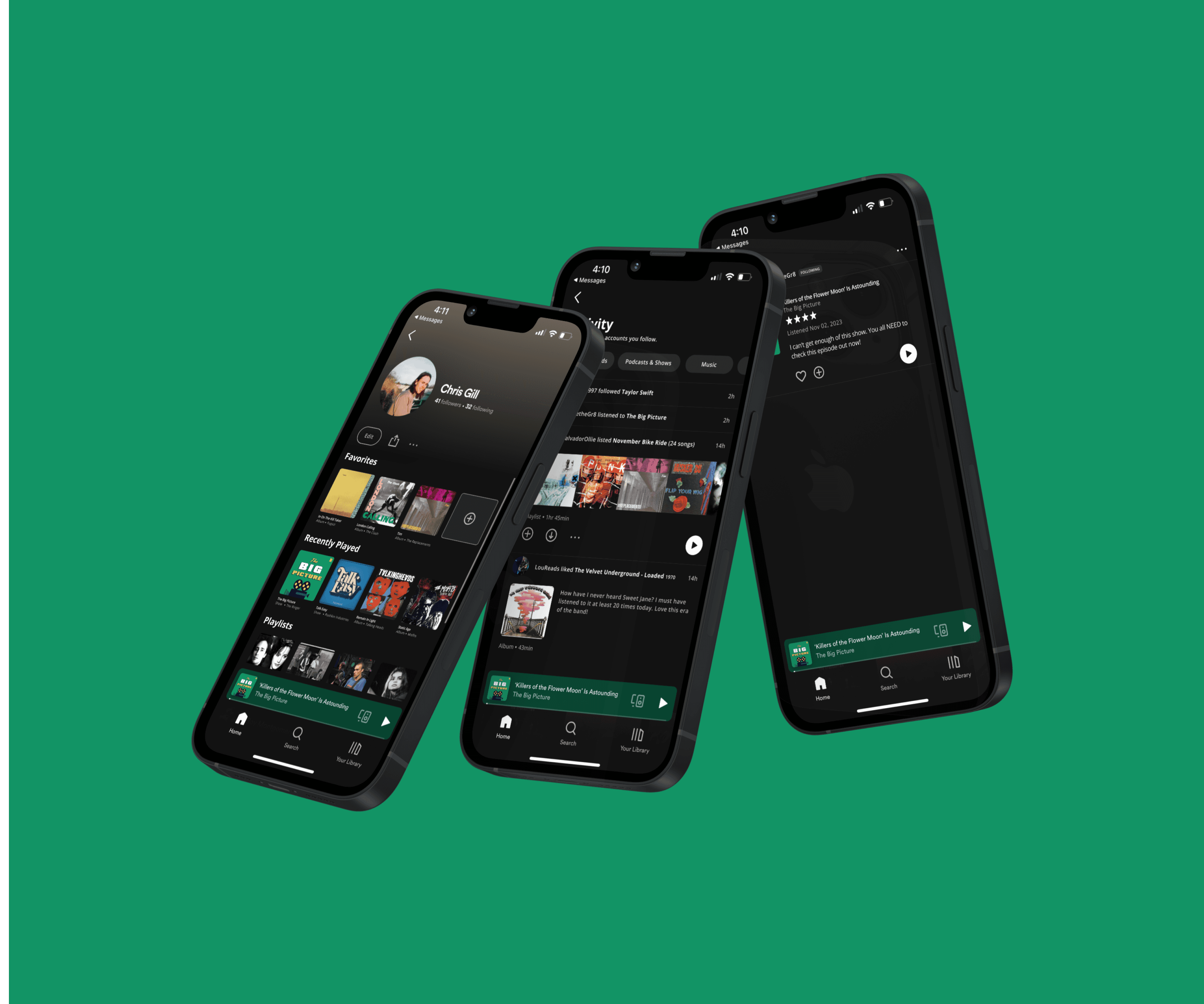
I developed two new features designed to allow users to communicate their taste to each other. These additions will encourage more interaction amongst music and podcast fans, which will in turn build a stronger community of fans and artists.
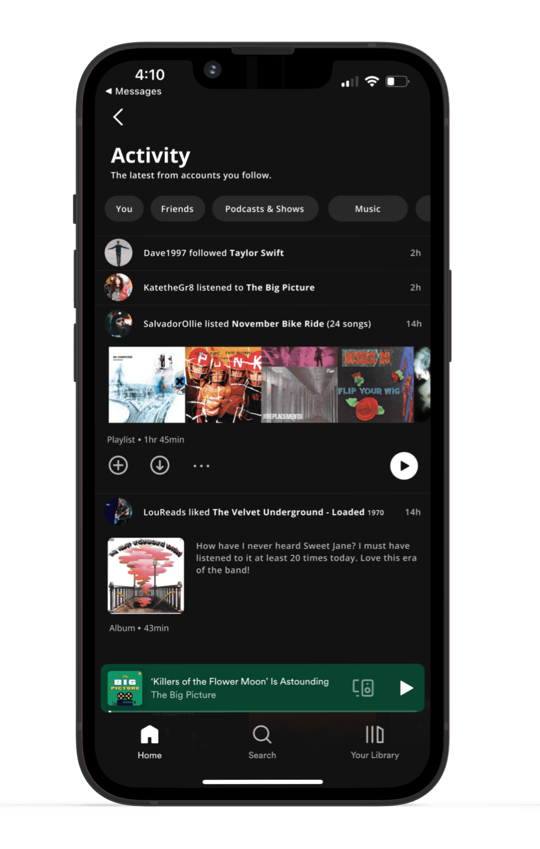
Activity Feed - An expansion of the activity bar, a feature that only appears on the desktop app, to include a broader, more personalized range of activity from users you follow.
Favorite Content - An updated user profile that includes the ability for users to showcase their favorite songs, albums, podcasts, or audiobooks.

Hypothesis
How might we make it easier for users to feel connected with one another while using Spotify?
I believe that the addition of an Activity Feed as well as Favorite Content features will drive user interaction within the Spotify app while building community through users sharing content amongst each other.
Research Phase
Competitive Research
Analyzing three of Spotify’s competitors revealed gaps in the comprehensiveness of social features across streaming music platforms. It was clear there was a lack of user profile customization. In addition, none of these competitors allow users to connect within the app by sharing content among other users.


User interviews
I conducted four interviews with current and past Spotify users to better understand the users’ preferences, habits, frustrations, and needs surrounding a streaming audio service, specifically Spotify.
Through these interviews, I was able to glean these key takeaways:
Users desire to feel more connected to each other and content creators through the audio services they use.
It was clear that people interviewed would like to be able to share audio content through their streaming service, not an outside app like Instagram.
Although people enjoy the algorithmically generated suggested content, they have begun to feel fatigued by it. They all mentioned wanting it to be easier to get suggested content by people they know, or follow.
Personas
Meet our primary personas, Jameson, The Independent Muscian and Trudy, The Post-Grad Rocker. By empthazing with the needs and frustrations of research particpants, I was able to define who the primary user of our product is. I kept these two in mind at every step of the design process.
IDeation Phase
refine
My research of Spotify’s competition space and user interviews signaled an increase in user engagement was possible through expanding upon their social and personalization features. This would create a space for users to rely more on Spotify for their communication regarding audio, thus spending more time on their platform.
Sitemap
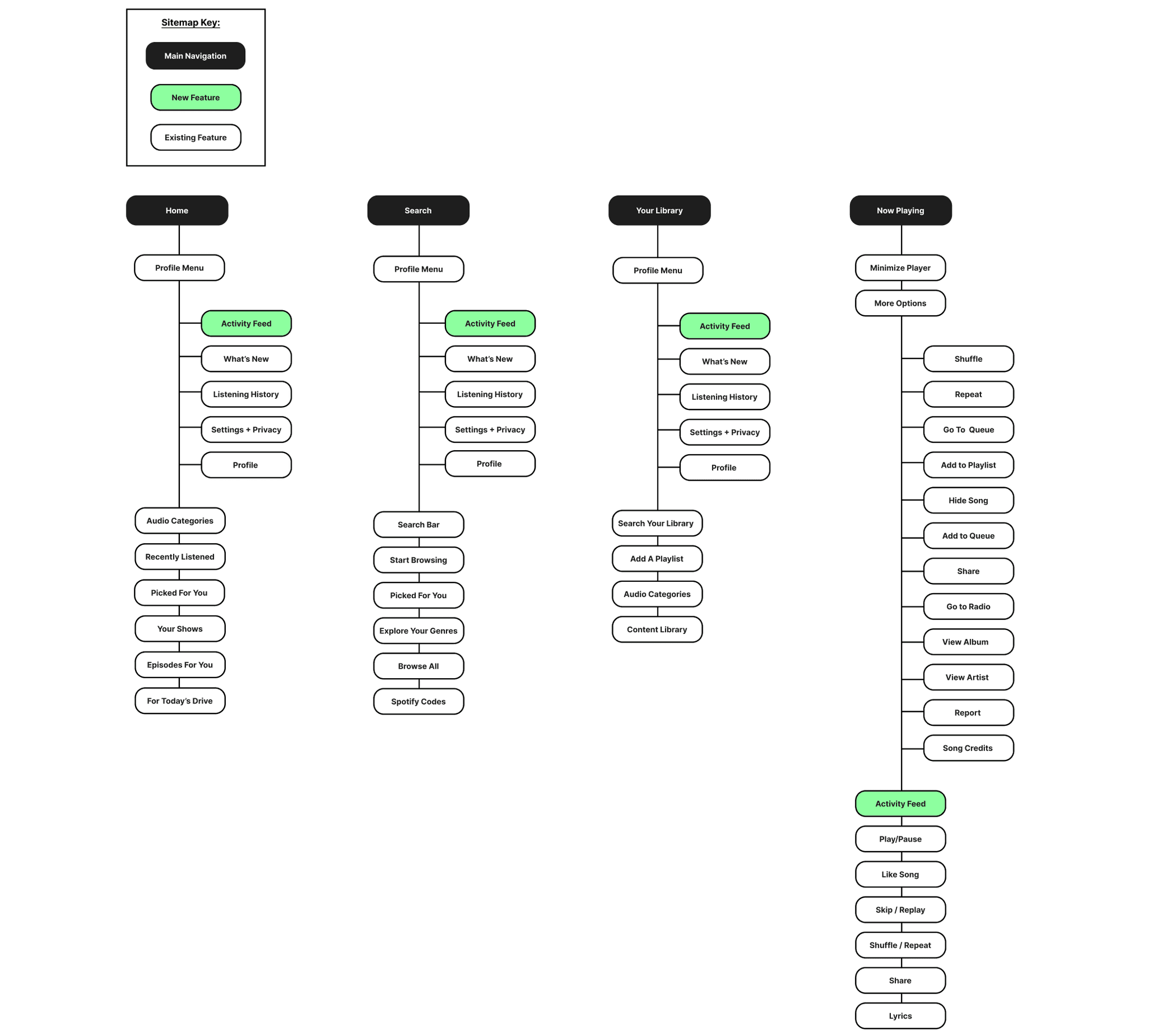
After refining what user's needed from Spotify, I developed a sitemap of how the two new features would be organized within the current design of the app. This outline was the first step in visualizing what these new features would feel like in the hands of users.

Task Flows
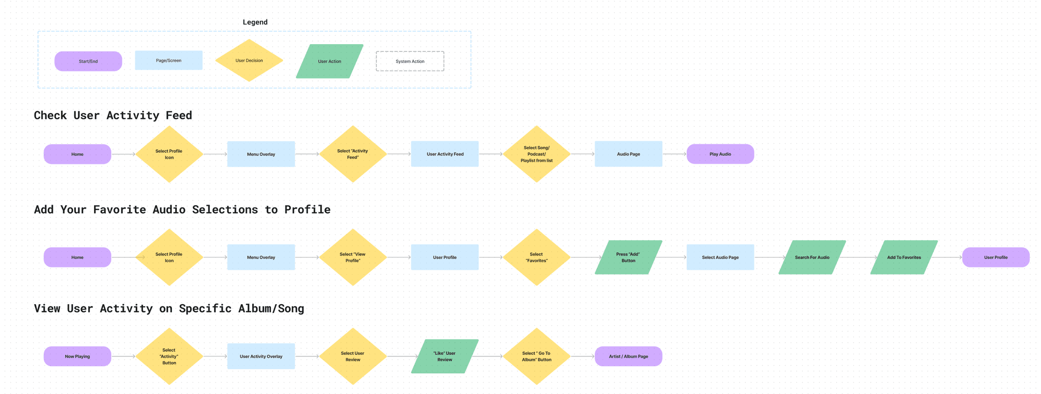
I explored what it would be like for a user to utilize these new features by creating task flows. I closely followed pre-existing design patterns on Spotify.
Testing these key flows:
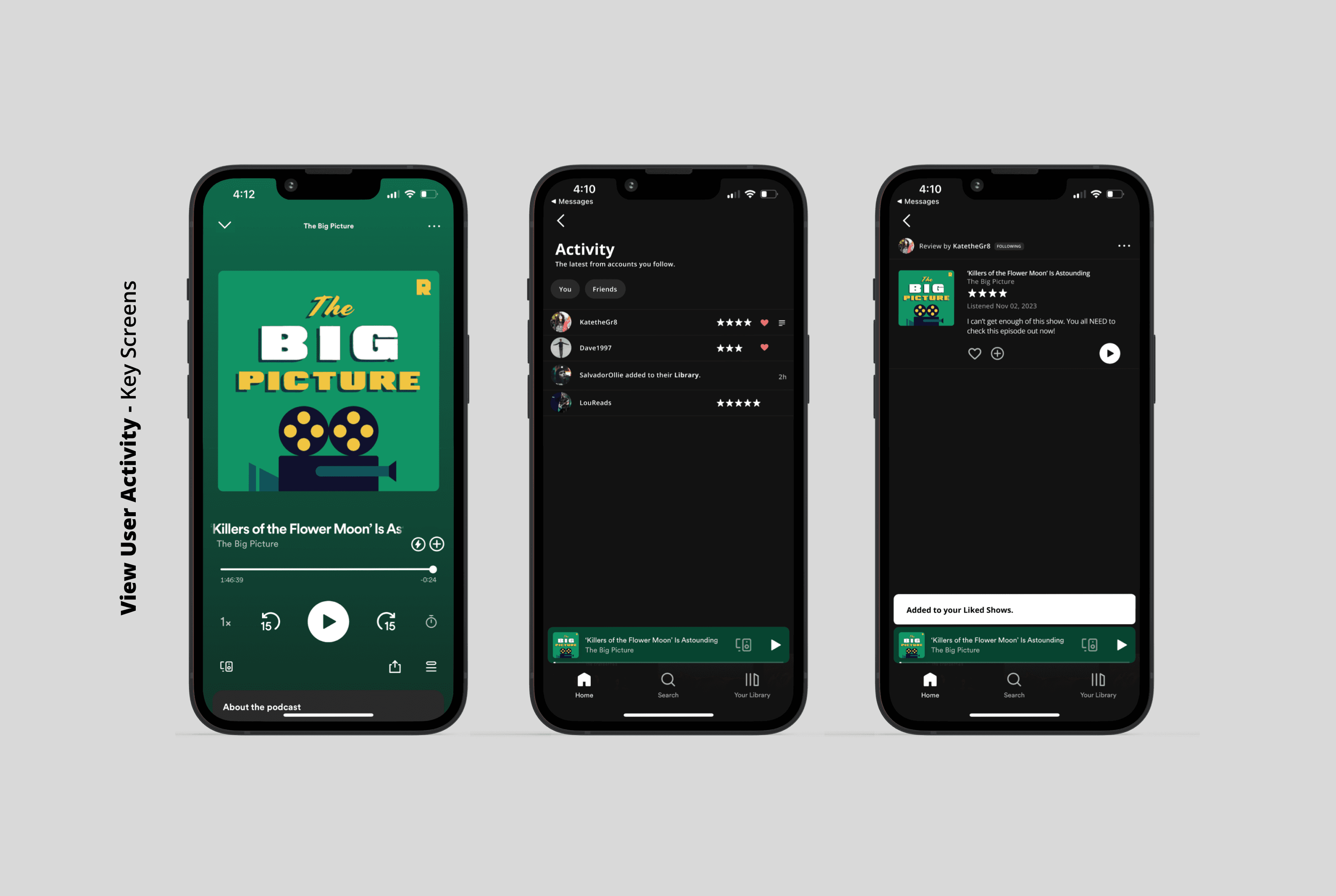
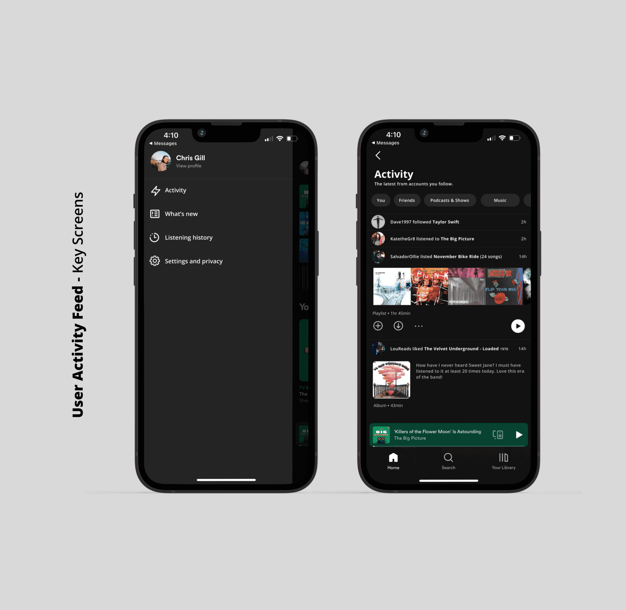
Check user activity feed
View user activity on a specific title
Add a title to your ‘Favorites’ profile feature

Interaction design
low-fi sketching
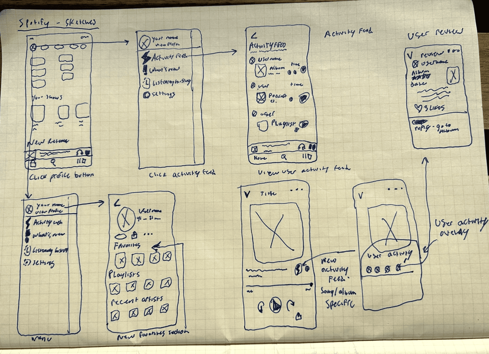
I used low-fidelity sketching to translate what these task flows would look like for users. Using pen and paper allows me to quickly visualize what these task flows would look like and further refines the focus of the project on the needs of the user. Stepping away from the screen to work on these sketches proved to be very helpful.

Mid-fidelity wireframes
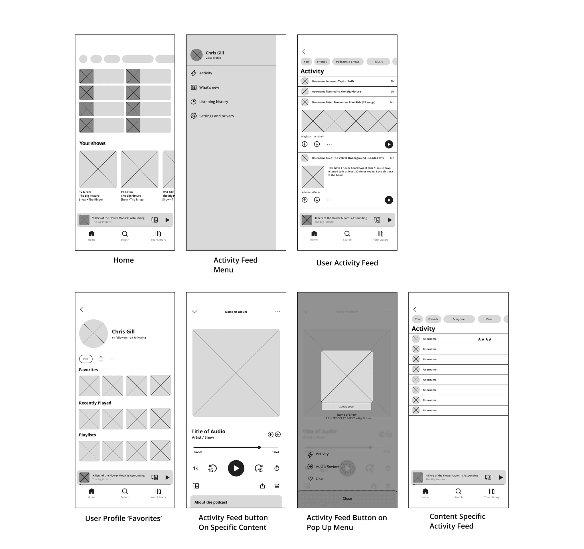
From there, I took these sketches and reworked them into a mid-fidelity outline that I could use in Figma to build upon for the high-fidelity screens of Spotify. These mid-fidelity wireframes are critical in going from the spark of an idea in the sketching stage, to building a strong outline that will become the prototype of the new features.

High Fidelity
Screens
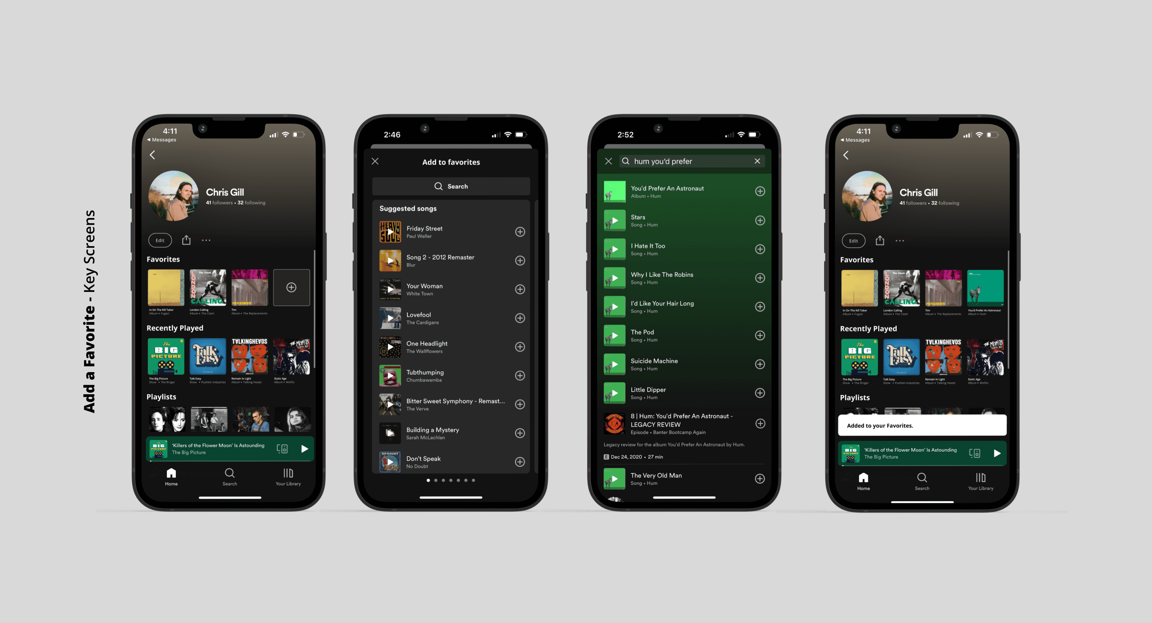
After iterating upon rudimentary sketches and outlining the key screens as mid-fi wireframes, I moved to the highest fidelity screens. I matched the current build of Spotify’s components and design patterns to create these three task flows for my prototype in Figma.



Interaction design
usability testing
After creating a prototype from the high-fidelity designs, I moved forward with usability testing to see how five potential users would use the application and receive feedback from them to be used for a round of priority iterations. I conducted the interviews virtually and in person. They were asked to perform these three tasks:
Check user activity feed
View user activity on a specific title
Add a title to your ‘Favorites’ profile feature
final prototype


results
Users were able to complete the tasks at a 100% completion rate. All participants had favorable feedback and showed eagerness for more social features to be implemented in Spotify's platform. Their feedback proved to be an essential guide in defining the next steps in the project:
Adding an alert overlay that introduces users to new features upon release. I found that when users are so familiar with an app they use daily that small iterations can confuse them without context.
Expanding upon the social features and customization. Developing a feature that allows users to share content akin to Instagram stories.
closing thoughts
This project involved familiarizing myself with the existing design system that Spotify utilizes and challenging myself to design a new feature within those constraints.
I developed two new features that enhanced users' Spotify experience and fit seamlessly into their current design.
Going forward with this project, I want to continue to develop upon the groundwork I built with this prototype of new features. Focussing on expanding community, social, and personalization features for users.
Role
UX/UI DESIGner
Service
Product Design, UX RESEARCH, Branding
Tools
figma, FigJam, Zoom, g-suite, Illustrator
Year
2023
Tools
figma, FigJam, Zoom, g-suite, Illustrator
Year
2023
Role
UX/UI DESIGner
Service
Feature Addition, Product Design, UX Researcher
Tools
figma, FigJam, Zoom, g-suite
Year
2023


Background
Spotify is a digital music, podcast, and video service that gives you access to millions of songs and other content from creators worldwide. Primarily, users subscribe to Spotify to stream music and podcasts across their devices, from mobile phones to televisions to desktop computers. Spotify allows users to pick up where they left off with a song or podcast on any of their devices at any time. Their mission statement leads their intentions with “Spotify’s mission is to unlock the potential of human creativity by allowing a million creative artists to live off their art and billions of fans the opportunity to enjoy and be inspired by it.” but, from the user’s perspective, Spotify is not a tool to unlock potential - it is a way to listen to an all-encompassing library of audio on any device, at any time for a low monthly subscription fee.
Challenge
Designing a new feature that helps users feel more connected to their community and that integrates seamlessly into Spotify’s existing design system.
Problem
Spotify has excelled at providing a seamless listening experience for its users and continues to offer intuitive features that help them discover or rediscover the audio they would like to listen to. Despite these improvements, Spotify could benefit from an added activity feed for users to view what the people they follow are currently listening to. I would like to add an activity feed feature because “unlocking the potential of human creativity” can genuinely be fostered when we connect, curate, and criticize content produced by real people listening to audio in real-time. Also, the desktop application currently has an activity feed that would suit the mobile build well. I would like to expand upon this idea and develop it for mobile users.
Solution
I developed two new features designed to allow users to communicate their taste to each other. These additions will encourage more interaction amongst music and podcast fans, which will in turn build a stronger community of fans and artists.
Activity Feed - An expansion of the activity bar, a feature that only appears on the desktop app, to include a broader, more personalized range of activity from users you follow.
Favorite Content - An updated user profile that includes the ability for users to showcase their favorite songs, albums, podcasts, or audiobooks.
INSERT PROTOTYPE VIDEO AND LINK!!!
Hypothesis
How might we make it easier for users to feel connected with one another while using Spotify?
I believe that the addition of an Activity Feed as well as Favorite Content features will drive user interaction within the Spotify app while building community through users sharing content amongst each other.
Research Phase
Competitive Research
Analyzing three of Spotify’s competitors revealed gaps in the comprehensiveness of social features across streaming music platforms. It was clear there was a lack of user profile customization. In addition, none of these competitors allow users to connect within the app by sharing content among other users.


User interviews
I conducted four interviews with current and past Spotify users to better understand the users’ preferences, habits, frustrations, and needs surrounding a streaming audio service, specifically Spotify.
Through these interviews, I was able to glean these key takeaways:
Users desire to feel more connected to each other and content creators through the audio services they use.
It was clear that people interviewed would like to be able to share audio content through their streaming service, not an outside app like Instagram.
Although people enjoy the algorithmically generated suggested content, they have begun to feel fatigued by it. They all mentioned wanting it to be easier to get suggested content by people they know, or follow.
Personas
Meet our primary personas, Jameson, The Independent Muscian and Trudy, The Post-Grad Rocker. By empthazing with the needs and frustrations of research particpants, I was able to define who the primary user of our product is. I kept these two in mind at every step of the design process.
IDeation Phase
refine
My research of Spotify’s competition space and user interviews signaled an increase in user engagement was possible through expanding upon their social and personalization features. This would create a space for users to rely more on Spotify for their communication regarding audio, thus spending more time on their platform.
Sitemap
After refining what user's needed from Spotify, I developed a sitemap of how the two new features would be organized within the current design of the app. This outline was the first step in visualizing what these new features would feel like in the hands of users.


Task Flows
I explored what it would be like for a user to utilize these new features by creating task flows. I closely followed pre-existing design patterns on Spotify.
Testing these key flows:
Check user activity feed
View user activity on a specific title
Add a title to your ‘Favorites’ profile feature


Interaction design
low-fi sketching
I used low-fidelity sketching to translate what these task flows would look like for users. Using pen and paper allows me to quickly visualize what these task flows would look like and further refines the focus of the project on the needs of the user. Stepping away from the screen to work on these sketches proved to be very helpful.


Mid-fidelity wireframes
From there, I took these sketches and reworked them into a mid-fidelity outline that I could use in Figma to build upon for the high-fidelity screens of Spotify. These mid-fidelity wireframes are critical in going from the spark of an idea in the sketching stage, to building a strong outline that will become the prototype of the new features.


High Fidelity
Screens
After iterating upon rudimentary sketches and outlining the key screens as mid-fi wireframes, I moved to the highest fidelity screens. I matched the current build of Spotify’s components and design patterns to create these three task flows for my prototype in Figma.


Interaction design
usability testing
After creating a prototype from the high-fidelity designs, I moved forward with usability testing to see how five potential users would use the application and receive feedback from them to be used for a round of priority iterations. I conducted the interviews virtually and in person. They were asked to perform these three tasks:
Check user activity feed
View user activity on a specific title
Add a title to your ‘Favorites’ profile feature
final prototype
(insert video of final prototype)
results
Users were able to complete the tasks at a 100% completion rate. All participants had favorable feedback and showed eagerness for more social features to be implemented in Spotify's platform. Their feedback proved to be an essential guide in defining the next steps in the project:
Adding an alert overlay that introduces users to new features upon release. I found that when users are so familiar with an app they use daily that small iterations can confuse them without context.
Expanding upon the social features and customization. Developing a feature that allows users to share content akin to Instagram stories.
closing thoughts
This project involved familiarizing myself with the existing design system that Spotify utilizes and challenging myself to design a new feature within those constraints.
I developed two new features that enhanced users' Spotify experience and fit seamlessly into their current design.
Going forward with this project, I want to continue to develop upon the groundwork I built with this prototype of new features. Focussing on expanding community, social, and personalization features for users.
Role
UX/UI DESIGner
Service
Feature Addition, Product Design, UX Researcher
Tools
figma, FigJam, Zoom, g-suite
Year
2023
Background
Spotify is a digital music, podcast, and video service that gives you access to millions of songs and other content from creators worldwide. Primarily, users subscribe to Spotify to stream music and podcasts across their devices, from mobile phones to televisions to desktop computers. Spotify allows users to pick up where they left off with a song or podcast on any of their devices at any time. Their mission statement leads their intentions with “Spotify’s mission is to unlock the potential of human creativity by allowing a million creative artists to live off their art and billions of fans the opportunity to enjoy and be inspired by it.” but, from the user’s perspective, Spotify is not a tool to unlock potential - it is a way to listen to an all-encompassing library of audio on any device, at any time for a low monthly subscription fee.
Challenge
Designing a new feature that helps users feel more connected to their community and that integrates seamlessly into Spotify’s existing design system.
Problem
Spotify has excelled at providing a seamless listening experience for its users and continues to offer intuitive features that help them discover or rediscover the audio they would like to listen to. Despite these improvements, Spotify could benefit from an added activity feed for users to view what the people they follow are currently listening to. I would like to add an activity feed feature because “unlocking the potential of human creativity” can genuinely be fostered when we connect, curate, and criticize content produced by real people listening to audio in real-time. Also, the desktop application currently has an activity feed that would suit the mobile build well. I would like to expand upon this idea and develop it for mobile users.
Solution
I developed two new features designed to allow users to communicate their taste to each other. These additions will encourage more interaction amongst music and podcast fans, which will in turn build a stronger community of fans and artists.
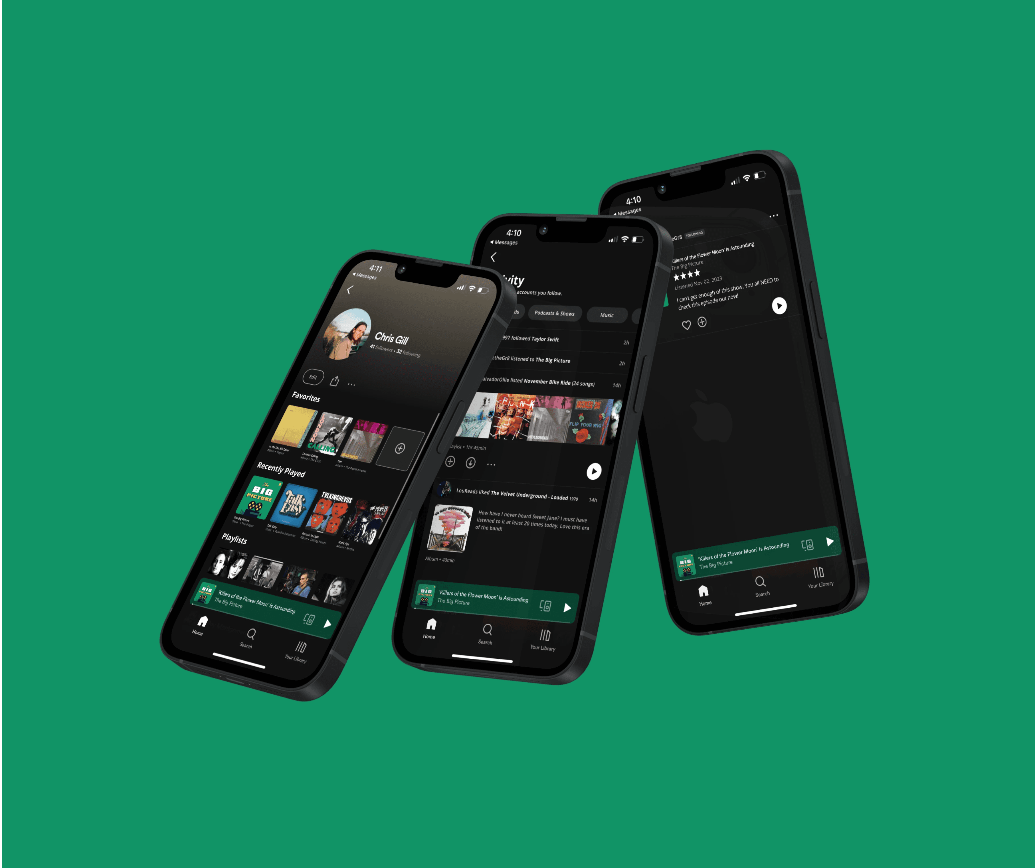
Activity Feed - An expansion of the activity bar, a feature that only appears on the desktop app, to include a broader, more personalized range of activity from users you follow.
Favorite Content - An updated user profile that includes the ability for users to showcase their favorite songs, albums, podcasts, or audiobooks.
Hypothesis
How might we make it easier for users to feel connected with one another while using Spotify?
I believe that the addition of an Activity Feed as well as Favorite Content features will drive user interaction within the Spotify app while building community through users sharing content amongst each other.
Research Phase
Competitive Research
Analyzing three of Spotify’s competitors revealed gaps in the comprehensiveness of social features across streaming music platforms. It was clear there was a lack of user profile customization. In addition, none of these competitors allow users to connect within the app by sharing content among other users.

User interviews
I conducted four interviews with current and past Spotify users to better understand the users’ preferences, habits, frustrations, and needs surrounding a streaming audio service, specifically Spotify.
Through these interviews, I was able to glean these key takeaways:
Users desire to feel more connected to each other and content creators through the audio services they use.
It was clear that people interviewed would like to be able to share audio content through their streaming service, not an outside app like Instagram.
Although people enjoy the algorithmically generated suggested content, they have begun to feel fatigued by it. They all mentioned wanting it to be easier to get suggested content by people they know, or follow.
Personas
Meet our primary personas, Jameson, The Independent Muscian and Trudy, The Post-Grad Rocker. By empthazing with the needs and frustrations of research particpants, I was able to define who the primary user of our product is. I kept these two in mind at every step of the design process.
IDeation Phase
refine
My research of Spotify’s competition space and user interviews signaled an increase in user engagement was possible through expanding upon their social and personalization features. This would create a space for users to rely more on Spotify for their communication regarding audio, thus spending more time on their platform.
Sitemap
After refining what user's needed from Spotify, I developed a sitemap of how the two new features would be organized within the current design of the app. This outline was the first step in visualizing what these new features would feel like in the hands of users.

Task Flows
I explored what it would be like for a user to utilize these new features by creating task flows. I closely followed pre-existing design patterns on Spotify.
Testing these key flows:
Check user activity feed
View user activity on a specific title
Add a title to your ‘Favorites’ profile feature

Interaction design
low-fi sketching
I used low-fidelity sketching to translate what these task flows would look like for users. Using pen and paper allows me to quickly visualize what these task flows would look like and further refines the focus of the project on the needs of the user. Stepping away from the screen to work on these sketches proved to be very helpful.

Mid-fidelity wireframes
From there, I took these sketches and reworked them into a mid-fidelity outline that I could use in Figma to build upon for the high-fidelity screens of Spotify. These mid-fidelity wireframes are critical in going from the spark of an idea in the sketching stage, to building a strong outline that will become the prototype of the new features.

High Fidelity
Screens
After iterating upon rudimentary sketches and outlining the key screens as mid-fi wireframes, I moved to the highest fidelity screens. I matched the current build of Spotify’s components and design patterns to create these three task flows for my prototype in Figma.


Interaction design
usability testing
After creating a prototype from the high-fidelity designs, I moved forward with usability testing to see how five potential users would use the application and receive feedback from them to be used for a round of priority iterations. I conducted the interviews virtually and in person. They were asked to perform these three tasks:
Check user activity feed
View user activity on a specific title
Add a title to your ‘Favorites’ profile feature
final prototype
results
Users were able to complete the tasks at a 100% completion rate. All participants had favorable feedback and showed eagerness for more social features to be implemented in Spotify's platform. Their feedback proved to be an essential guide in defining the next steps in the project:
Adding an alert overlay that introduces users to new features upon release. I found that when users are so familiar with an app they use daily that small iterations can confuse them without context.
Expanding upon the social features and customization. Developing a feature that allows users to share content akin to Instagram stories.
closing thoughts
This project involved familiarizing myself with the existing design system that Spotify utilizes and challenging myself to design a new feature within those constraints.
I developed two new features that enhanced users' Spotify experience and fit seamlessly into their current design.
Going forward with this project, I want to continue to develop upon the groundwork I built with this prototype of new features. Focussing on expanding community, social, and personalization features for users.
Role
UX/UI DESIGner
Service
Feature Addition, Product Design, UX Researcher
Tools
figma, FigJam, Zoom, g-suite
Year
2023

Background
Spotify is a digital music, podcast, and video service that gives you access to millions of songs and other content from creators worldwide. Primarily, users subscribe to Spotify to stream music and podcasts across their devices, from mobile phones to televisions to desktop computers. Spotify allows users to pick up where they left off with a song or podcast on any of their devices at any time. Their mission statement leads their intentions with “Spotify’s mission is to unlock the potential of human creativity by allowing a million creative artists to live off their art and billions of fans the opportunity to enjoy and be inspired by it.” but, from the user’s perspective, Spotify is not a tool to unlock potential - it is a way to listen to an all-encompassing library of audio on any device, at any time for a low monthly subscription fee.
Challenge
Designing a new feature that helps users feel more connected to their community and that integrates seamlessly into Spotify’s existing design system.
Problem
Spotify has excelled at providing a seamless listening experience for its users and continues to offer intuitive features that help them discover or rediscover the audio they would like to listen to. Despite these improvements, Spotify could benefit from an added activity feed for users to view what the people they follow are currently listening to. I would like to add an activity feed feature because “unlocking the potential of human creativity” can genuinely be fostered when we connect, curate, and criticize content produced by real people listening to audio in real-time. Also, the desktop application currently has an activity feed that would suit the mobile build well. I would like to expand upon this idea and develop it for mobile users.
Solution
I developed two new features designed to allow users to communicate their taste to each other. These additions will encourage more interaction amongst music and podcast fans, which will in turn build a stronger community of fans and artists.
Activity Feed - An expansion of the activity bar, a feature that only appears on the desktop app, to include a broader, more personalized range of activity from users you follow.
Favorite Content - An updated user profile that includes the ability for users to showcase their favorite songs, albums, podcasts, or audiobooks.
Hypothesis
How might we make it easier for users to feel connected with one another while using Spotify?
I believe that the addition of an Activity Feed as well as Favorite Content features will drive user interaction within the Spotify app while building community through users sharing content amongst each other.
Research Phase
Competitive Research
Analyzing three of Spotify’s competitors revealed gaps in the comprehensiveness of social features across streaming music platforms. It was clear there was a lack of user profile customization. In addition, none of these competitors allow users to connect within the app by sharing content among other users.

User interviews
I conducted four interviews with current and past Spotify users to better understand the users’ preferences, habits, frustrations, and needs surrounding a streaming audio service, specifically Spotify.
Through these interviews, I was able to glean these key takeaways:
Users desire to feel more connected to each other and content creators through the audio services they use.
It was clear that people interviewed would like to be able to share audio content through their streaming service, not an outside app like Instagram.
Although people enjoy the algorithmically generated suggested content, they have begun to feel fatigued by it. They all mentioned wanting it to be easier to get suggested content by people they know, or follow.
Personas
Meet our primary personas, Jameson, The Independent Muscian and Trudy, The Post-Grad Rocker. By empthazing with the needs and frustrations of research particpants, I was able to define who the primary user of our product is. I kept these two in mind at every step of the design process.
IDeation Phase
refine
My research of Spotify’s competition space and user interviews signaled an increase in user engagement was possible through expanding upon their social and personalization features. This would create a space for users to rely more on Spotify for their communication regarding audio, thus spending more time on their platform.
Sitemap
After refining what user's needed from Spotify, I developed a sitemap of how the two new features would be organized within the current design of the app. This outline was the first step in visualizing what these new features would feel like in the hands of users.

Task Flows
I explored what it would be like for a user to utilize these new features by creating task flows. I closely followed pre-existing design patterns on Spotify.
Testing these key flows:
Check user activity feed
View user activity on a specific title
Add a title to your ‘Favorites’ profile feature

Interaction design
low-fi sketching
I used low-fidelity sketching to translate what these task flows would look like for users. Using pen and paper allows me to quickly visualize what these task flows would look like and further refines the focus of the project on the needs of the user. Stepping away from the screen to work on these sketches proved to be very helpful.

Mid-fidelity wireframes
From there, I took these sketches and reworked them into a mid-fidelity outline that I could use in Figma to build upon for the high-fidelity screens of Spotify. These mid-fidelity wireframes are critical in going from the spark of an idea in the sketching stage, to building a strong outline that will become the prototype of the new features.

High Fidelity
Screens
After iterating upon rudimentary sketches and outlining the key screens as mid-fi wireframes, I moved to the highest fidelity screens. I matched the current build of Spotify’s components and design patterns to create these three task flows for my prototype in Figma.


Interaction design
usability testing
After creating a prototype from the high-fidelity designs, I moved forward with usability testing to see how five potential users would use the application and receive feedback from them to be used for a round of priority iterations. I conducted the interviews virtually and in person. They were asked to perform these three tasks:
Check user activity feed
View user activity on a specific title
Add a title to your ‘Favorites’ profile feature
final prototype
results
Users were able to complete the tasks at a 100% completion rate. All participants had favorable feedback and showed eagerness for more social features to be implemented in Spotify's platform. Their feedback proved to be an essential guide in defining the next steps in the project:
Adding an alert overlay that introduces users to new features upon release. I found that when users are so familiar with an app they use daily that small iterations can confuse them without context.
Expanding upon the social features and customization. Developing a feature that allows users to share content akin to Instagram stories.
closing thoughts
This project involved familiarizing myself with the existing design system that Spotify utilizes and challenging myself to design a new feature within those constraints.
I developed two new features that enhanced users' Spotify experience and fit seamlessly into their current design.
Going forward with this project, I want to continue to develop upon the groundwork I built with this prototype of new features. Focussing on expanding community, social, and personalization features for users.
Let's work together.
Let's work together.
Let's work together.


